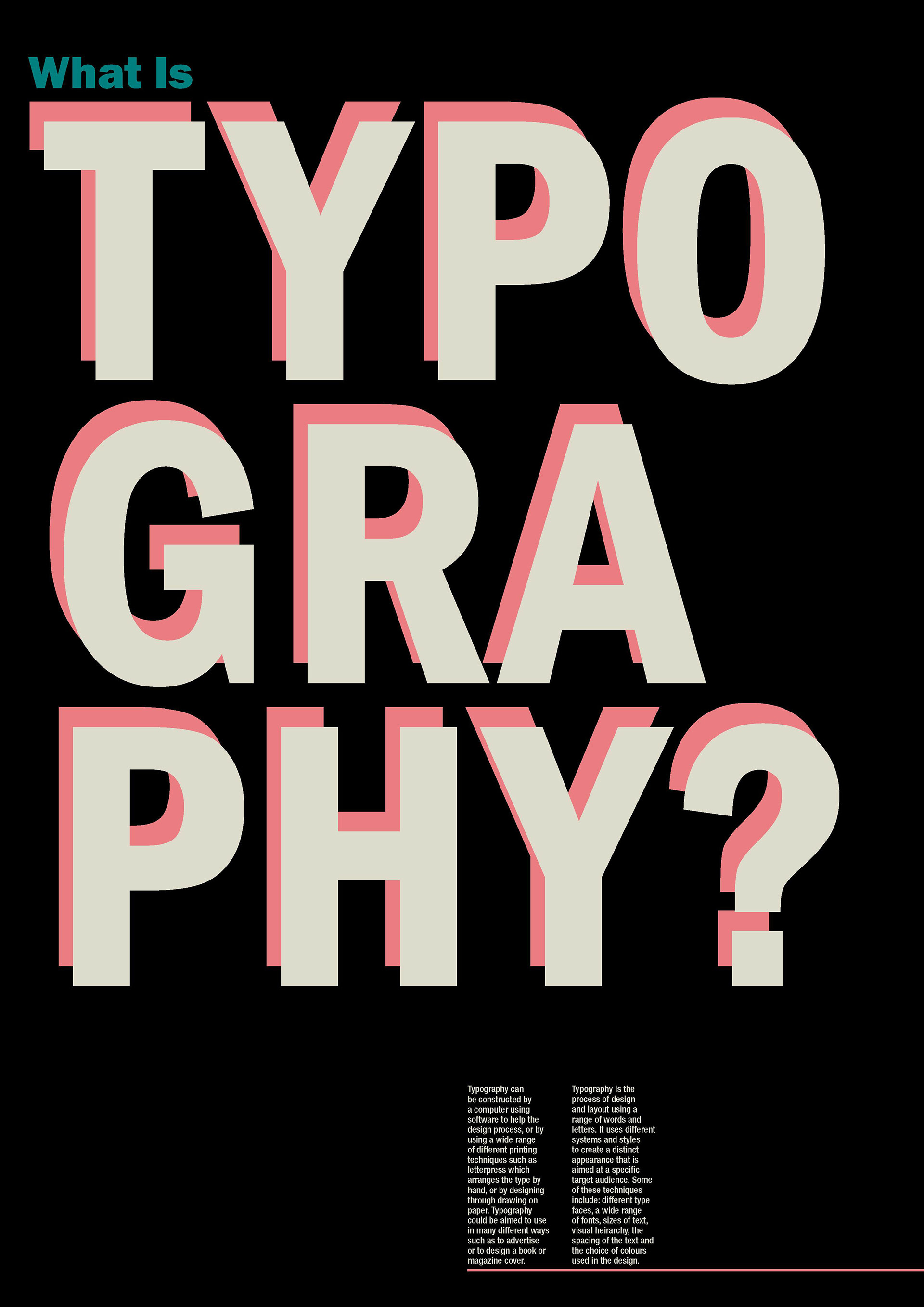
This project is called Typography and Layout, which I completed in my first year of University. In this project, I created a poster titled ‘What Is Typography’, informing the viewer of the topic of typography.
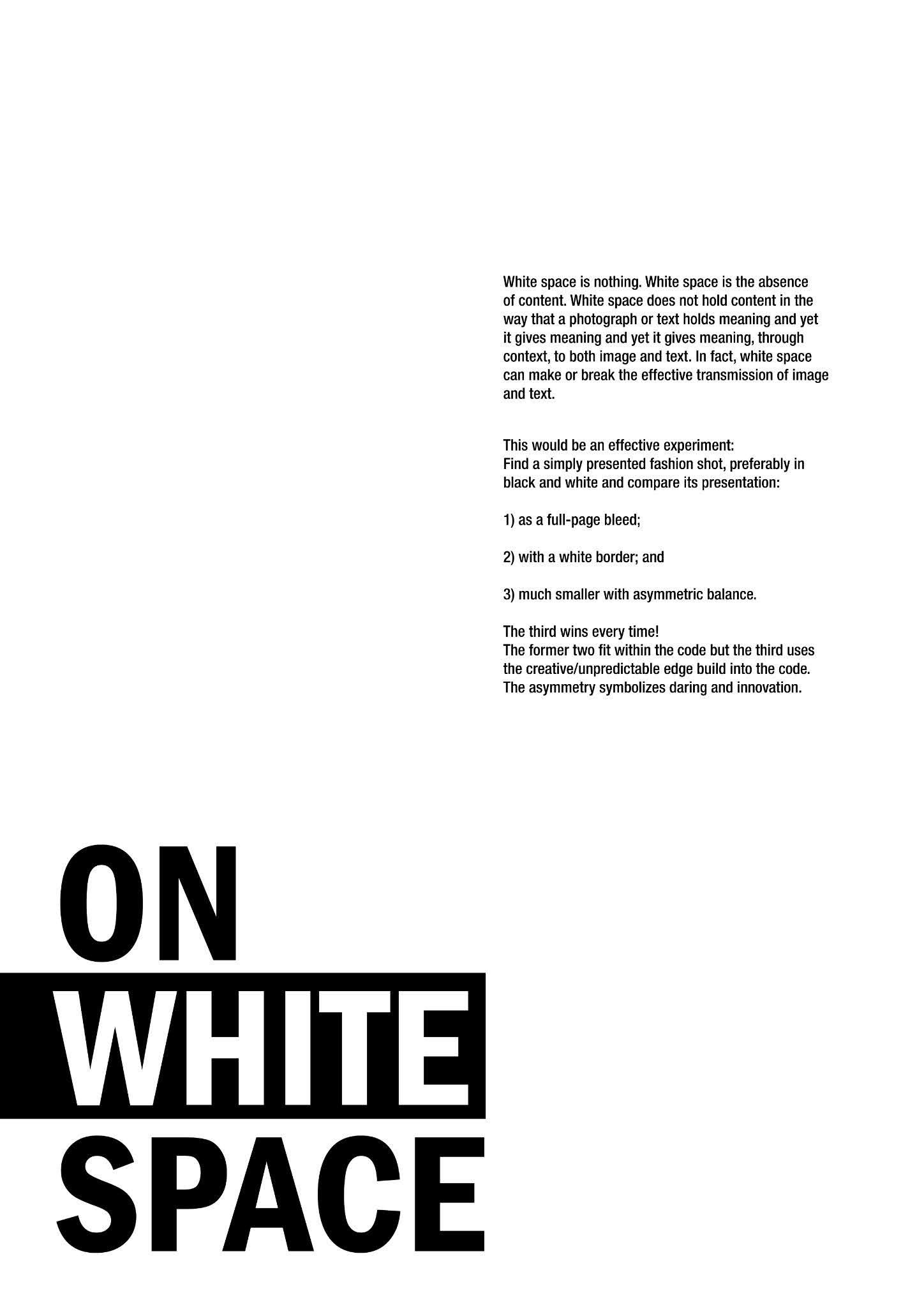
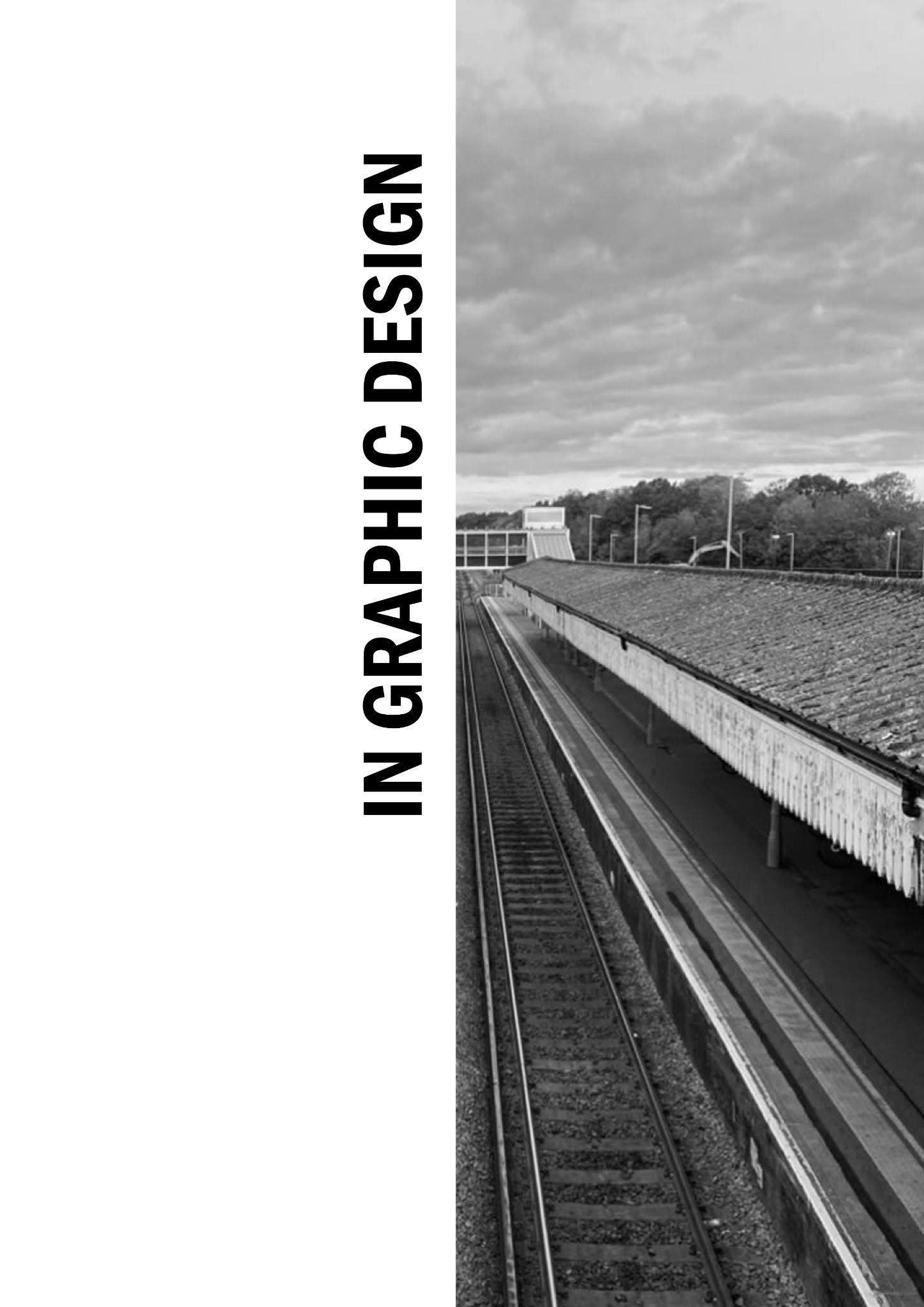
The other piece of work I created for this module is a magazine, where I used my knowledge of layout to form a two page magazine spread about the topic of white space. Both spreads use white space to create an aesthetic that aligns with the magazines text, using black and white images to reinforce the feeling, and use them for tools when it comes to forming a layout for the magazine. I liked the idea of exploring the subjects of the posters by using them to solidify the ideas of the text and give a example of what it could look like.